Choosing a logo style can become a surprisingly expensive distraction. One concept looks polished on a website, another fits neatly into a social profile, and a third feels distinctive until nobody can tell what the business is called.
The right decision is not simply the design you like most. It is the style that helps the right customer recognize, remember and trust your business across the places where the brand will actually appear.
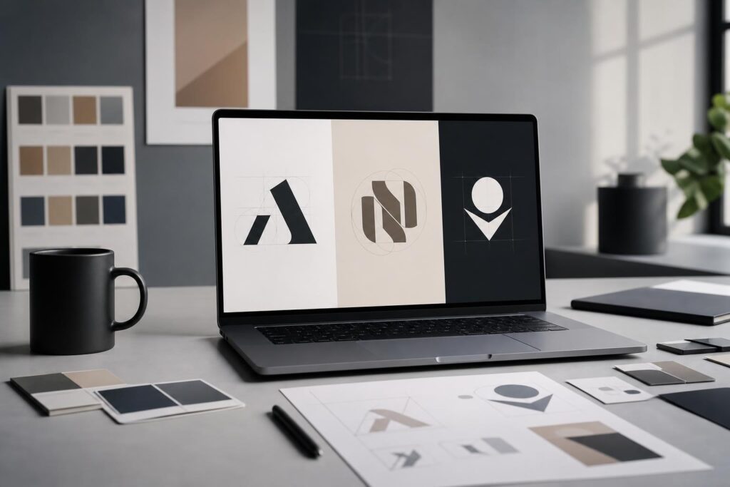
For most new businesses, the choice starts with three directions: a wordmark built around the full business name, a monogram made from initials, or a standalone symbol. Each can work, but they solve different communication problems.
The practical difference between the three logo styles
Wordmark: make the business name the visual identity
A wordmark presents the full business name using distinctive typography, spacing and styling. It puts recognition ahead of symbolism: customers see the logo and immediately see what to call the company.
This is often a strong starting point for a new business that has not yet built name recognition. It can work especially well when the name is short, pronounceable and visually manageable.
Consider a local cleaning company called BrightNest or a software startup called LumaDesk. A clear wordmark repeatedly connects the visual identity to the exact name customers should search for, say aloud or recommend.
A wordmark tends to fit when:
- Your business name is short or moderately sized.
- The name itself is memorable or descriptive.
- You are launching and need to establish name recognition.
- Clarity matters more than creating an abstract visual idea.
The main limitation is space. A long name may become hard to read in a small profile image, browser icon or compact mobile layout. Typography also has to do more of the branding work, so an ordinary type treatment can feel generic.
Monogram: compress a longer name into a recognizable mark
A monogram uses one or more initials as the central logo element. It is useful when a full name is long, when customers naturally abbreviate the business, or when a compact mark is needed across many placements.
A professional services firm with a multi-word name, for example, might use its initials on social profiles and small branded assets while presenting the full name nearby on its website and formal documents.
A monogram tends to fit when:
- Your business has a long or multi-word name.
- The initials form a clean, memorable arrangement.
- Your audience already uses the abbreviation.
- You need a compact mark without introducing an unrelated icon.
The risk is ambiguity. Initials such as “AC” or “MS” may look refined but say little to someone encountering the business for the first time. If the brand is new, the monogram may need to appear with the full name until recognition grows.
Symbol: build recognition around a visual idea
A symbol is an icon or graphic mark that can represent the business without spelling out its name. It can be literal, such as a simplified object connected to the service, or more abstract, using shape and form to suggest an idea.
Symbols are useful in compact spaces and can give a brand a recognizable visual asset. They are also the hardest of the three directions to make self-explanatory. A new company cannot assume that customers will connect an unfamiliar icon to its name.
A symbol tends to fit when:
- You need a strong icon for compact digital placements.
- Your offer has a visual concept that can be expressed without clichés.
- You plan to use the symbol alongside the business name during launch.
- Your brand needs to work across products, packaging or content formats.
A symbol should not be selected just because it looks modern. If five businesses in your category could use the same icon without modification, it is probably not carrying enough distinctive meaning.
Use four business questions to narrow the choice
Instead of comparing isolated designs, evaluate each style against the way your business needs to communicate.
1. Does your name help or hinder recognition?
A short, distinctive name is an argument for a wordmark. A long legal-style name may benefit from a monogram. A name that is easy to say but difficult to represent typographically might work with a symbol-and-name pairing.
Be careful with initials that create awkward combinations or are already associated with many other organizations. Compression is only useful when it makes the identity easier to remember.
2. How familiar is the business?
New brands usually need to make their name visible. That favors a wordmark or a symbol paired with the full name. A standalone symbol asks the audience to make a connection they may not have learned yet.
A monogram has the same challenge if customers do not naturally know the abbreviation. Your launch-stage logo should reduce the effort required to identify you, not create a decoding exercise.
3. Where will the logo appear most often?
List the real placements before choosing a direction: website header, mobile menu, social avatar, storefront sign, proposal, invoice, packaging or profile image. Then ask which concept remains clear in the smallest and most restrictive use.
A horizontal wordmark may work beautifully in a website header but struggle inside a square avatar. A symbol may fit the avatar but fail to communicate the name on a proposal. This is why many businesses eventually use a small family of coordinated logo variations rather than forcing one arrangement into every space.
4. What should the style communicate?
Typography, shape, spacing and color influence whether a logo feels established, approachable, technical, energetic or premium. Style should follow the customer expectation and business position, not a temporary visual trend.
A family-focused local service may need warmth and immediate clarity. A professional advisory firm may prioritize restraint and credibility. A creator brand may have more room for an expressive visual signature. None of these choices requires unnecessary complexity.
A better way to compare logo concepts with AI
Generating random logo ideas one after another rarely improves the decision. A better workflow is to compare the three styles using the same strategic brief.
Write down the business name, audience, offer, desired personality, preferred visual characteristics and any obvious category clichés to avoid. Then explore three controlled directions:
- A name-led wordmark focused on legibility and character.
- A compact monogram based on the strongest initials.
- A simple symbol concept shown alongside the full name.
This gives you a useful comparison rather than a gallery of unrelated options. Elite UI’s AI Logo Generator is designed for guided brand concepts, making it a practical starting point for founders who need to generate and refine a direction without staring at a blank canvas.
Judge the resulting concepts using the same criteria. Can you read or identify the mark quickly? Does it still make sense at a small size? Does it suit the customer and category? Can it appear on both a website and a business document without feeling out of place?
Do not ask only which option looks most impressive in a large presentation. Ask which one will remain useful during ordinary business operations.
Common objections before using an AI logo generator
“Will the result look generic?”
It can if the direction is generic. Broad instructions such as “modern logo for a consulting business” leave little strategic material to work with. A clearer brief should identify the audience, brand personality, name structure and ideas to avoid.
Generation should also be treated as concept development, not automatic approval. Compare alternatives, remove predictable category imagery and refine the strongest route. Human judgment remains essential.
“Do I need design experience to choose well?”
You do not need to be a professional designer to make a better initial decision, but you do need objective criteria. Prioritize clarity, relevance, versatility and distinctiveness over decorative detail.
If the logo will support a complex brand architecture, major packaging rollout or high-stakes rebrand, professional design help may still make sense. A self-serve generator is particularly useful for exploring directions, clarifying preferences and moving an early-stage brand forward.
“What about trademarks and similar logos?”
A generated concept should not be assumed to be legally available or exclusive. Before committing to a logo, conduct appropriate searches and seek qualified legal guidance when trademark protection matters. Visual appeal is not a substitute for clearance.
Is an AI Logo Generator the right fit for your situation?
It is likely a useful fit if you are launching a small business, testing a new brand direction, replacing a temporary text logo or trying to compare wordmark, monogram and symbol concepts efficiently.
It can also help marketers, creators and small teams establish a clearer direction before applying the identity to other assets. Once the core logo direction is settled, you can develop supporting visuals with the AI Image Editor and consider how the identity will appear in a customer-ready site through the AI Website Builder.
It may be less suitable as the only step when your organization has multiple sub-brands, complex stakeholder requirements or extensive trademark considerations. In those situations, concept generation can still inform the process, but broader strategic and professional review may be appropriate.
Make the choice based on recognition, not preference alone
Choose a wordmark when the full name is an asset and early recognition is the priority. Choose a monogram when initials genuinely simplify a longer identity. Choose a symbol when a visual idea adds meaning and you have a plan to connect it to the business name.
You do not need to solve every future brand application before moving forward. You need a clear, defensible direction that works for the customers and placements you have now. Compare the three approaches with one consistent brief, refine the strongest concept and test it in realistic contexts.
Ready to turn the decision into a visual direction? Create Your Logo.
Ready to Turn This Into a Faster Workflow?
Try AI Logo Generator inside Elite UI and move from research into a real business-ready result.
Product features, pricing, plan details and availability may change. Check the current Elite UI product page for the latest information before purchasing or publishing.