A new business logo can become a surprisingly effective form of procrastination. You compare typefaces, debate whether the icon feels distinctive enough, change the colors and then return to the first concept days later.
The problem is rarely a lack of options. It is the absence of a decision process.
Your first logo does not need to express every aspect of your business. It needs to identify the company, support the right impression and remain usable wherever customers encounter it. The following workflow helps you reach that point without turning one brand asset into a month-long project.
Start by defining the logo’s job
Before choosing colors or symbols, decide what the logo must accomplish during the next stage of your business.
A local plumbing company may need a clear, dependable mark that works on a website, vehicle and uniform. A software startup may prioritize a clean identity for its product interface and sales materials. A creator may need a recognizable profile image plus a wordmark for a website or digital product.
Write a one-sentence job description for the logo:
Our logo should help our business look established and approachable when customers see it on our website, social profiles and service materials.
This statement creates a filter. If a visually interesting idea does not support the intended impression or work in the required settings, it is not the right concept.
Make five decisions before generating concepts
You do not need a complete brand strategy to begin. You do need enough direction to prevent every possible style from competing for attention.
1. Choose two brand qualities
Select two qualities you want people to associate with the business. Useful combinations include:
- Dependable and friendly for a local home-service company
- Precise and modern for a professional consultancy
- Confident and energetic for a fitness creator
- Refined and calm for a premium wellness business
- Practical and innovative for a business software product
Avoid choosing six or seven adjectives. Too many qualities create contradictory visual instructions. Two primary qualities provide enough direction while leaving room to explore.
2. Decide how literal the symbol should be
A literal symbol directly represents the service, such as a roof for a roofing company. An abstract symbol communicates a broader idea, such as movement, connection or precision. A wordmark may use no separate symbol at all.
Literal marks can make a new business easier to understand, but familiar industry imagery can also feel interchangeable. Abstract marks can be more distinctive, but they may require the business name and surrounding message to explain the offer.
Ask whether the logo must explain the category or simply identify the company. A new local service may benefit from more category clarity. A startup with a descriptive business name may have more freedom to use an abstract mark.
3. Select a typography direction
Do not begin by comparing dozens of individual fonts. First choose a broad direction: traditional, modern, friendly, technical or editorial.
A law office and a children’s activity company should not solve typography in the same way. The question is not which font is universally best. It is which direction supports the expectations customers bring to your category without making the business look indistinguishable from every competitor.
4. Set a color boundary
Choose one primary color direction and one neutral direction before evaluating concepts. For example, you might explore deep blue with a warm neutral, or muted green with charcoal.
This is a boundary, not a demand for a precise shade. It keeps color from distracting you while you judge the more fundamental structure of the logo. Your concept should also remain understandable in a single color, because not every placement will support the full palette.
5. List the three most important placements
A logo viewed only on a large presentation slide can hide practical problems. Identify the placements that matter most at launch, such as:
- Website header
- Social media profile
- Proposal or invoice
- Storefront, vehicle or uniform
- Product packaging
- App or browser icon
Limit the list to three priorities. You can create additional variations later, but the primary concept should work in the contexts your customers will actually see first.
Generate directions, not endless variations
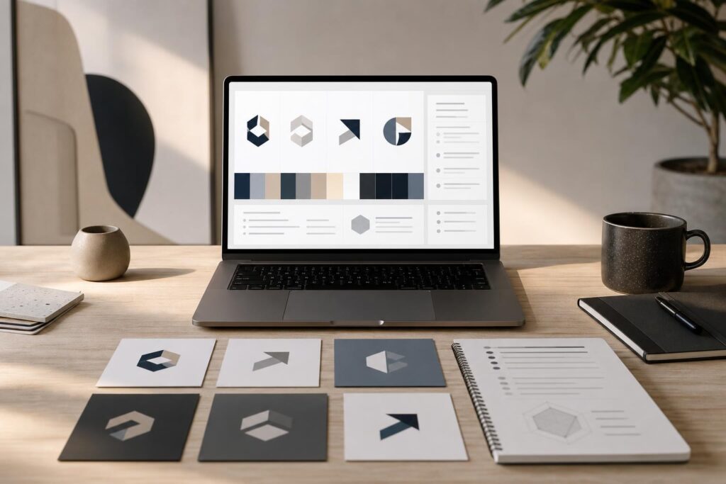
Once these constraints are clear, use them to explore a small number of genuinely different directions. The purpose of an AI-assisted workflow is not to produce hundreds of options. It is to turn your business inputs into concepts you can compare and refine.
The Elite UI AI Logo Generator is designed for guided brand concepts, giving founders a practical place to move from broad ideas toward a focused logo direction. It is especially useful when you need a visual starting point but do not want to stare at a blank canvas or manually construct every initial idea.
A productive concept round might include three directions:
- A clear wordmark focused on the business name
- A combination mark with a simple symbol and name
- A more distinctive direction based on an abstract brand idea
If you generate multiple near-identical versions too early, you will spend time comparing minor details before deciding whether the overall direction is right. Compare structures first. Refine color, spacing and smaller details after one direction emerges.
Score each concept instead of asking which one you “like”
Personal preference matters, but it should not be the only test. Use a simple scoring framework to make the decision more objective.
Rate each concept from one to five on the following criteria:
- Clarity: Does it feel appropriate for the business and audience?
- Legibility: Can the business name be read quickly at a practical size?
- Distinctiveness: Is there something recognizable without relying on unnecessary complexity?
- Versatility: Does the structure work horizontally, compactly and in one color?
- Longevity: Is the concept based on the business rather than a temporary visual trend?
A concept that earns consistent scores is usually a better launch choice than one dramatic option with serious usability weaknesses.
If several stakeholders are involved, ask each person to score independently before discussing the results. This reduces the chance that the loudest opinion determines the outcome.
Test the logo in realistic situations
A logo is not finished when it looks attractive in isolation. Place the leading concept into rough versions of the environments where it will appear.
Reduce it to the size of a social profile image. Put it against a light and dark background. Position it in a sample website header. View it in grayscale. If the business relies on proposals or invoices, test it at the top of a plain document.
This does not require a complete brand rollout. You are checking whether the design survives contact with reality.
Also compare the logo with the business name and online identity. If the name is still unsettled, verify realistic web-address options with the Elite UI Domain Search before investing heavily in brand materials. A coordinated name, domain and logo is easier to launch than three disconnected decisions.
Use a stop rule to prevent revision loops
Founders often continue editing because no one has defined what “done” means. Set the stop rule before the final comparison.
Your logo is ready for launch when it:
- Supports the two chosen brand qualities
- Is readable in the most important placements
- Works in a simple one-color version
- Does not create obvious confusion with your category or offer
- Receives no major objections during a final practical review
Ready does not mean immune to future improvement. Businesses evolve, audiences become clearer and visual systems expand. The goal is to choose a credible identity that lets you move forward with the website, sales materials and customer experience.
Is an AI logo generator the right fit?
An AI logo generator is a strong fit when you are launching a new business, validating an idea, refreshing an early identity or exploring directions before investing in a larger branding engagement. It can help a solo founder or small team move from vague preferences to tangible concepts faster.
Custom design support may make more sense when you need extensive market research, complex brand architecture, a complete identity system or specialized guidance across many physical and digital applications. AI-assisted concept generation does not replace business judgment, legal review or an experienced designer when the project requires that depth.
Before adopting any final logo, search for similar marks in your market and consider appropriate trademark guidance for your jurisdiction. A generated concept should still receive the same business and legal diligence as a manually designed one.
Common concerns before choosing a concept
Will an AI-generated logo look generic?
It can if you begin with generic inputs and select the first familiar symbol. Distinctiveness comes from combining clear brand qualities, an appropriate typography direction, meaningful constraints and careful concept selection. Treat generation as exploration, not automatic approval.
Do I need the perfect logo before launching?
No. You need a usable, credible logo that supports the business you are launching now. Waiting for a design that expresses every future possibility usually delays more important work, including building the offer and reaching customers.
Should I ask everyone I know for feedback?
Broad opinion gathering often creates more confusion because people judge according to personal taste. Ask a small number of people who understand the intended customer, then give them specific questions about clarity, impression and legibility.
Turn the chosen direction into a working brand asset
The fastest logo process is not the one with the fewest clicks. It is the one that separates strategic decisions from visual exploration, compares a limited set of directions and ends with a clear standard for approval.
Define the job, narrow the style, generate focused concepts, score them in context and stop when the logo meets the needs of the launch. When you are ready to move from indecision to a visual direction, Create Your Logo with Elite UI.
Ready to Turn This Into a Faster Workflow?
Try AI Logo Generator inside Elite UI and move from research into a real business-ready result.
Product features, pricing, plan details and availability may change. Check the current Elite UI product page for the latest information before purchasing or publishing.