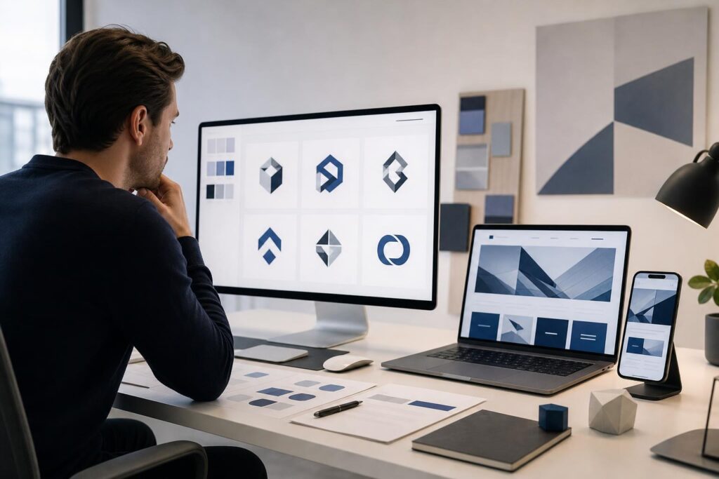
Your logo may look polished in a presentation, on a large design canvas or at the top of a business plan. The real test begins when it has to fit inside a website header, remain clear on a phone and sit beside navigation, buttons and other conversion elements.
That is where many new businesses discover avoidable logo problems. The mark is too detailed, the name becomes unreadable or the colors only work on one background. Fixing those issues after the website has been designed can create rework across the header, footer, social graphics and launch materials.
A better approach is to evaluate the logo as a working website asset before committing to the full design. This audit focuses on the decisions that matter most.
Why a website exposes logo weaknesses
A logo is not an isolated piece of art. On a business website, it has a specific job: help visitors identify the company quickly without competing with the message, navigation or next step.
Website layouts also place practical limits on a logo. A desktop header may have generous horizontal space, while a mobile header has very little. A transparent logo may sit over a dark background on one page and a light background on another. A detailed symbol that looks impressive at presentation size may become an unclear shape when reduced.
That does not mean every business needs an extremely minimal logo. It means the concept should remain recognizable in the environments where customers will actually encounter it.
Nine logo mistakes to catch before building the website
1. Designing the logo without considering the header
A tall or highly stacked logo can force the website header to use more vertical space than necessary. That pushes the main message and call to action farther down the screen, especially on mobile devices.
Test the concept inside a shallow horizontal rectangle. If the business name, symbol and tagline cannot fit without becoming cramped, you may need a simpler header variation. The full arrangement can still be used in larger brand applications.
2. Trying to communicate every service in one symbol
A contractor does not need a logo containing a roof, hammer, wrench, truck and house. A consultant does not need every part of the process represented in one icon.
Combining too many ideas usually weakens recognition. Choose one useful direction: the business category, the result customers want, a distinctive initial or an abstract brand characteristic. Your website copy can explain the complete offer.
3. Choosing a style before defining the intended impression
It is easy to select a logo because it looks modern, luxurious or playful. The more important question is whether that impression fits the business and the expectations of its customers.
A family-focused service may need to feel approachable and clear. A professional advisory firm may prioritize restraint and credibility. A creator brand may have more room for expressive typography. Write down three qualities the logo should communicate before comparing concepts.
4. Depending on color for recognition
A concept that only works in one color combination will be difficult to use consistently. Website footers, browser tabs, invoices and promotional graphics may all introduce different backgrounds or size constraints.
Review the mark in a single color. The underlying shape and wordmark should still be understandable. This check is not about removing color from the identity; it is about making sure color supports the logo rather than rescuing it.
5. Approving the logo only at a large size
Fine lines, small gaps and decorative letterforms can disappear when the logo is reduced. The business name may also become hard to read long before the symbol does.
Place the concept at approximately the size it would appear in a mobile header. Do not zoom in. If you have to study it to identify the name or shape, simplify the concept before moving forward.
This is a useful point to explore alternatives rather than force an unsuitable direction into the website. The Elite UI AI Logo Generator helps founders work through guided brand concepts, making it practical to compare directions against real launch requirements instead of judging one idea in isolation.
6. Treating the tagline as a permanent part of the logo
A tagline may add context on a storefront sign or presentation cover, but it often becomes unreadable in a website header. It can also create problems if the company later changes its positioning.
Keep the business name and primary mark capable of standing on their own. Use the tagline as a separate text element when the layout has enough room and the message helps the visitor.
7. Using inconsistent logo arrangements
New businesses sometimes recreate the logo for each application: one font on the website, another on a proposal and a different symbol on social profiles. Even minor changes can make a young brand feel less deliberate.
Decide which arrangement is primary and which limited alternatives are acceptable. For example, you might use a horizontal version in the header and a compact symbol where space is restricted. These should feel like parts of one system, not unrelated designs.
8. Collecting feedback without a decision framework
Asking people which logo they like can produce contradictory opinions. Personal taste does not reveal whether a concept will work for your customers or website.
Give reviewers specific questions. Can they read the business name quickly? What type of company do they expect it to represent? Does the mark remain clear at a small size? Which of your intended brand qualities does it communicate?
Feedback becomes more useful when it is connected to the logo’s job.
9. Waiting until the website is finished to finalize the direction
The website and logo do not need to be completed in a rigid sequence, but they should inform each other. If the site is designed around a placeholder and the final logo has a very different shape, tone or color direction, key sections may need to be reconsidered.
Establish a credible logo direction early, test it in a basic page layout and then refine both systems together. If you are building the digital presence yourself, the AI Website Builder can help move the broader website concept forward once the brand direction is clear.
The seven-part website logo test
Before approving a concept, place it in realistic contexts rather than reviewing it only on a blank canvas. Use this checklist:
- Desktop header: Does it fit beside the navigation without dominating the page?
- Mobile header: Is the name or symbol identifiable in limited space?
- Light and dark backgrounds: Can you maintain useful contrast in both settings?
- Single-color use: Does the core design remain understandable without its full palette?
- Small application: Are the important shapes still distinct when the mark is reduced?
- Footer or secondary placement: Does the logo remain clear in a quieter, lower-priority area?
- Brand consistency: Does it match the tone of the offer, copy and visual direction?
A failed test does not always mean starting again. You may only need to remove a tagline, reduce detail or establish a compact variation. The goal is to solve the problem before it spreads across the rest of the brand.
Is an AI logo generator the right fit?
A guided logo generator is a practical fit when you are launching a new business, validating an offer, refreshing an early-stage identity or trying to turn an unclear idea into comparable visual directions. It is especially useful for founders who know the impression they want but need help exploring how that direction could look.
It may not be the final answer for every situation. A company with complex brand architecture, unusual production requirements or an established identity may benefit from custom design support. Businesses facing trademark questions should also seek appropriate legal guidance; generating a visual concept does not establish ownership or clearance.
The self-serve route works best when you treat the output as a decision tool, not an excuse to skip judgment. Define the audience, intended impression and website constraints first. Then evaluate each concept against those requirements.
Common concerns before using an AI logo generator
Will the logo look generic?
Generic results are more likely when the brand direction is generic. “Modern business logo” gives you little basis for choosing among concepts. A clearer brief—such as calm, precise and established for a bookkeeping service—creates a stronger evaluation standard.
Your judgment still matters. Avoid selecting a concept merely because it looks polished. Check whether it fits your category, feels appropriate for your customers and survives the website logo test.
Do I still need a professional designer?
Not necessarily for every launch, but an AI tool should not be framed as a universal replacement for design expertise. A founder may use it to create an initial direction quickly, compare ideas or prepare a more focused brief. A designer can be valuable when the identity requires extensive customization, a complete brand system or specialized production work.
Should I finalize the logo before writing the website?
You should finalize the strategic direction early, but the work can overlap. Your positioning helps determine the logo’s tone, while early website layouts reveal practical issues with shape, scale and contrast. Use that feedback loop before locking either one.
A better pre-launch logo workflow
- Describe the audience, offer and three qualities the brand should convey.
- Explore several concepts without committing to the first polished option.
- Shortlist directions using business relevance rather than taste alone.
- Test each option in desktop, mobile, light, dark and small-scale contexts.
- Refine the strongest direction and define when each approved arrangement will be used.
- Carry the final direction consistently into the website and launch materials.
Your logo does not have to explain the entire business. It needs to identify the brand, fit the customer experience and remain usable wherever the business appears.
If your current idea has not passed those tests, explore clearer directions before the website design makes the decision harder to change. Create Your Logo with Elite UI and evaluate each concept as a real business asset, not just an image on a canvas.
Ready to Turn This Into a Faster Workflow?
Try AI Logo Generator inside Elite UI and move from research into a real business-ready result.
Product features, pricing, plan details and availability may change. Check the current Elite UI product page for the latest information before purchasing or publishing.