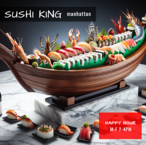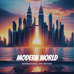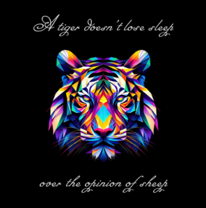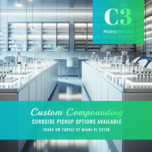

Your logo may look polished on a white design canvas and still fail in the places customers actually see it. The colors can disappear against a website header, become muddy in a social profile image or lose their impact when a vendor prints them in one color.
The problem is often not the initial color choice. It is the lack of a practical logo color system: a small set of approved variations designed for different backgrounds, sizes and production constraints.
Building that system early helps you evaluate logo concepts more realistically. It also reduces the temptation to improvise a new color treatment whenever you create a flyer, update your website or order signage.
Think Beyond a Single “Official” Logo
A primary full-color logo is important, but it cannot cover every use case. A website may need a light version for a dark navigation bar. A promotional product may allow only one ink color. A black-and-white document may remove the contrast that made the original concept work.
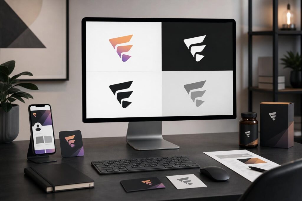
Most small businesses benefit from planning four core treatments:
- Primary color: The preferred version for suitable light or neutral backgrounds.
- Reverse: A light or white treatment for dark backgrounds, photos or colored sections.
- One-color: A solid version that can be reproduced with one ink or one material.
- Grayscale or black: A dependable option for monochrome documents, basic printing and situations where color is unavailable.
These are not four different logos. They are controlled versions of the same identity. The shape, spacing and overall recognition should remain consistent even as the color treatment changes.
Start With the Places Your Logo Must Work
Before evaluating colors, list the environments that matter to your business. A creator launching online courses may care most about video thumbnails, profile images and a website. A local contractor may need vehicle graphics, uniforms, yard signs and invoices. An ecommerce brand may prioritize packaging, product labels and marketplace images.
This context changes what makes a color direction practical. A subtle palette can feel sophisticated on a large website banner but become indistinct when compressed into a small circular avatar. A bright color can attract attention on screen but may require careful print testing before it appears consistently on packaging.
Ask three questions for each likely placement:
- What background will usually sit behind the logo?
- How small might the logo appear?
- Will the format support full color, limited color or no color?
This quick inventory gives you criteria for judging concepts rather than choosing solely by personal taste.
Build the Color System in a Practical Order
1. Select a primary treatment with enough separation
Your main logo colors should remain visually distinct from one another and from their expected background. If a symbol contains several similar tones, check whether its important shapes merge when viewed at a smaller size.
Color can support the personality you want to convey, but it should not carry the entire identity. A strong mark should retain recognizable structure even when its colors are removed.
2. Create a reverse treatment intentionally
Simply turning every element white may not always preserve the visual balance of the original. Fine details can become too prominent, while gaps that looked clear on white may close up on a dark background.
Test the reverse version on solid dark colors and over representative photography. If the logo sits on a busy image, it may need a simple container or a less distracting image area rather than another improvised color.
3. Reduce the concept to one color
The one-color test reveals whether the concept depends too heavily on gradients, overlapping transparent elements or small changes in tone. This matters for stamps, embroidery, vinyl graphics, engraved items and economical print applications.
A one-color variation does not mean every future application must be plain. It gives you a reliable fallback when production methods are limited.
4. Verify grayscale behavior
Different colors can appear similar when converted to gray. Two sections that looked separate in full color may collapse into the same tone. Reviewing a grayscale version helps expose this problem before the logo appears on invoices, copied documents or monochrome marketing materials.
If you are still exploring directions, the Elite UI AI Logo Generator can help you generate guided brand concepts to compare. The goal is not to accept the first visually appealing result. Use the concepts as decision-ready starting points, then assess each one against your real backgrounds and formats.
Test Concepts in Context, Not Just Side by Side
A row of logo options on a blank page does not show how they will behave in the market. Place the strongest candidates into a few realistic mockups before choosing a direction.
For a service business, that might include a mobile website header, a social profile circle, an invoice and a vehicle door. For a startup, try a landing page, presentation cover, app-style icon area and event badge. A creator might test a video thumbnail, media kit and merchandise tag.
You do not need to produce every final asset during this stage. Simple mockups are enough to expose predictable issues such as weak contrast, excessive detail or awkward proportions. If you need to prepare channel-specific visual assets later, the AI Image Editor provides image generation, uploads, stock images, text, shapes, effects, layers and export tools in one workflow.
Common Logo Color Mistakes to Catch Early
Using color to compensate for an unclear concept
An exciting gradient can make a weak symbol feel more finished than it is. Review the logo in solid black early. If the underlying structure is confusing, adding more color is unlikely to solve it.
Choosing too many equal-priority colors
Several colors can work, but they need a hierarchy. Decide which color leads, which supports and which is reserved for limited accents. Without that hierarchy, every brand asset can feel different.
Ignoring the website environment
Your logo and website should not be designed as unrelated projects. Navigation backgrounds, buttons, photography and page sections all affect how the logo appears. When you move into site creation, test the selected identity within an actual page structure using a workflow such as the AI Website Builder.
Expecting one file to handle every production method
A transparent full-color file is useful, but it is not a complete logo system. Printers and fabricators may need a simpler treatment depending on the job. Confirm their file and color requirements rather than assuming the website version can be reused unchanged.
Is an AI Logo Generator the Right Fit?
An AI logo generator is useful when you need to move from a vague idea to concrete visual directions, compare possible styles or establish a starting point before launching your website and marketing assets. It can be especially practical for founders, creators and small teams that do not yet have a clear brand concept.
It is not a substitute for business judgment. You still need to decide what fits your audience, whether the concept is distinctive enough for your market and how it performs across real applications. Businesses with complex brand architecture, extensive packaging systems or specialized production needs may also benefit from custom design support.
“What if the first concepts are not right?”
Treat early results as exploration, not a final verdict. Clarify the business type, desired personality, preferred visual direction and unsuitable elements. Then compare new concepts using the same criteria instead of changing your preferences with every option.
“Will an AI-generated concept work everywhere automatically?”
No logo concept should be assumed to work everywhere without testing. Review primary, reverse, one-color and grayscale treatments, then place the strongest option into realistic web, social and print contexts. The quality of the decision depends on this evaluation step, not only on how quickly the first concept appears.
Make the Decision With a Simple Approval Check
Before committing to a logo color direction, confirm that it stays recognizable on light and dark backgrounds, remains clear at small sizes, works in one color and supports the personality your business needs to communicate. Also check that your primary colors can extend into a broader website and marketing palette without making every element compete for attention.
You do not need dozens of variations. You need a controlled set that covers your actual business channels and gives future assets a consistent foundation.
Ready to turn your brand direction into concepts you can evaluate across those use cases? Create Your Logo.
Ready to Turn This Into a Faster Workflow?
Try AI Logo Generator inside Elite UI and move from research into a real business-ready result.
Product features, pricing, plan details and availability may change. Check the current Elite UI product page for the latest information before purchasing or publishing.