
A new SaaS product can be useful, technically sound and still feel difficult to trust. Prospects arrive with limited context, scan an unfamiliar interface and try to answer several questions at once: What does this do? Is it meant for me? Will it be difficult to use? What happens after I sign up?
If the website and product interface do not answer those questions quickly, more features rarely solve the problem. The real issue is often presentation: weak hierarchy, inconsistent interactions, vague messaging or a disconnect between the marketing promise and the product experience.
Premium SaaS UI design addresses that gap. Not by adding decoration for its own sake, but by turning an unfamiliar product into a clear, coherent journey that buyers can evaluate with less uncertainty.
Why SaaS trust begins with comprehension
People are cautious around software they do not understand. Even an attractive interface can create hesitation if users cannot identify the primary action, predict what a control will do or connect a feature to a useful outcome.
A strong first experience should help a visitor answer three questions:
- What is the product for? The positioning, page structure and interface should point toward a recognizable job or business outcome.
- How does it work? Screens, demonstrations and interaction patterns should make the workflow feel learnable.
- What should I do next? The next action should be visible without forcing the user to interpret several competing paths.
This is why trust is not created by visual polish alone. Trust grows when the website, onboarding and product interface behave like parts of the same system. Consistent language, layout and visual cues make the experience feel intentional rather than improvised.
What makes SaaS UI design feel premium
“Premium” should not mean excessive animation, dense dashboards or dramatic visual effects. In a business product, premium design usually feels calm, focused and appropriate to the task.
A clear visual hierarchy
Every screen needs a dominant purpose. A landing page may need to explain one core value proposition. A dashboard may need to prioritize a current task, recent result or next step. When headings, supporting copy, controls and secondary information all compete equally, the user has to design the journey for themselves.
Hierarchy reduces that burden. It uses spacing, scale, grouping, contrast and placement to show what matters now and what can wait.
Consistent interaction patterns
If similar buttons look different, labels change between screens or navigation behaves unpredictably, users must continually relearn the product. Consistent components make an interface easier to scan and help people form accurate expectations.
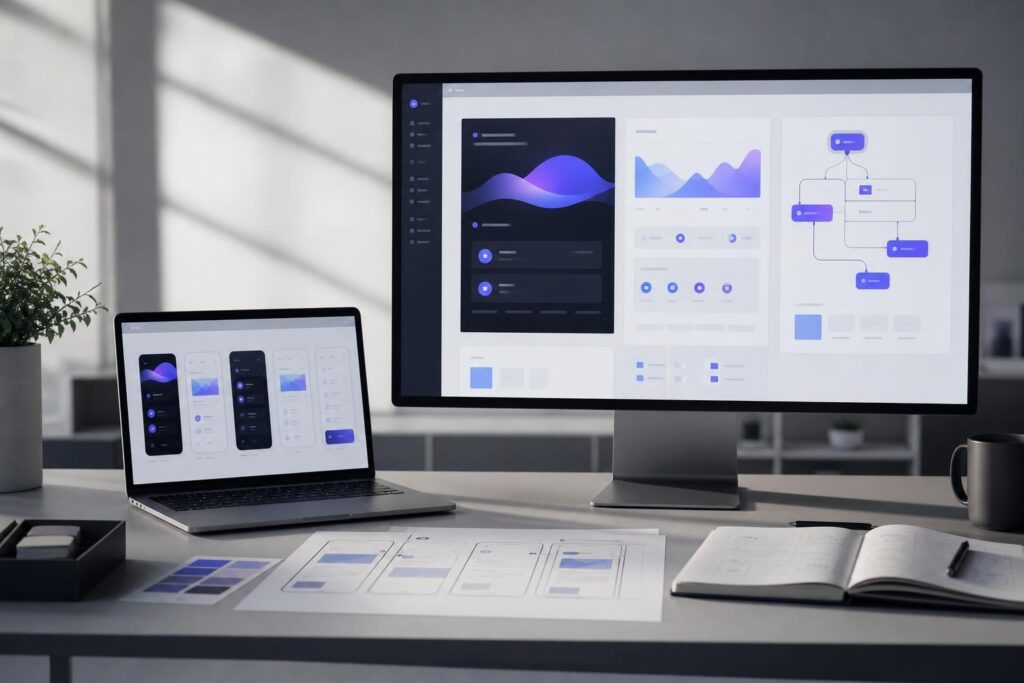
This matters especially for AI editors, SaaS dashboards and workflow products with multiple states. Uploading an asset, generating a result, editing an output and exporting the finished work should feel like one connected process rather than a collection of separate features.
Useful context at moments of uncertainty
Users should not need to leave an important task to understand what a field, setting or action means. Concise helper text, descriptive empty states and clear feedback can reduce ambiguity without turning every screen into a manual.
For example, a local-service scheduling product might clarify what customers receive after submitting a request. A creator tool might explain which asset is being edited before an irreversible action. A reporting platform might distinguish saved data from a temporary preview.
Alignment between promise and experience
If a landing page promotes simplicity but the first product screen presents ten equally prominent options, the experience contradicts the claim. If a website emphasizes professional collaboration but the interface uses vague labels and unfinished-looking states, the brand promise becomes harder to believe.
Premium UI design carries the same product story from the first marketing page into the working interface.
A practical workflow for improving clarity and trust
Before redesigning individual screens, examine the sequence a new buyer or user experiences. The following workflow helps keep design decisions tied to comprehension rather than taste.
- Define the primary user and job. Identify who is arriving, what they are trying to accomplish and what they already understand. A marketing manager evaluating an analytics tool needs different context than a consumer booking a home service.
- Map the shortest credible journey. Trace the path from the landing page to the first useful outcome. Note where the user must choose, enter information, wait for a result or interpret an unfamiliar term.
- Assign one purpose to each major screen. Decide what the screen must explain or enable before adding supporting content. Secondary features can remain available without dominating the experience.
- Design the states between actions. Consider what users see before they begin, while work is processing, when no data exists, after success and when something needs correction. These states often shape trust as much as the ideal finished screen.
- Review the journey with realistic content. Placeholder copy can hide hierarchy problems. Test screens with plausible service names, plan descriptions, form labels, product outputs and calls to action.
This work is particularly valuable before development becomes difficult to change, before a major launch or before sending paid traffic to a product that prospects struggle to interpret.
When the experience spans a marketing website, landing pages and a specialized application, an Elite UI custom website and product design engagement can help shape those pieces as one coherent customer journey. The goal is not merely a polished mockup; it is a clearer route from initial interest to meaningful product use.
When custom design is the right fit
Custom design makes sense when the product has a workflow that generic templates cannot communicate well. That may include a new SaaS dashboard, an AI editor, a multi-step service platform, a customer portal or a landing page that must explain an unfamiliar offer.
It is also a strong fit when different parts of the experience have been assembled at different times. A startup may have a polished homepage but an inconsistent application. A service business may have a clear offer but a confusing inquiry flow. A creator platform may show many capabilities without helping new users choose where to begin.
Custom design is most useful when confusion is tied to the structure of the experience—not simply the color palette.
A self-serve option may be more appropriate when the offer is straightforward, the required pages are conventional and speed matters more than a unique product workflow. For that situation, the Elite UI AI Website Builder can help generate a conversion-focused business website without beginning with a fully custom engagement.
The decision is not “template or quality.” It is whether your product can be represented clearly within an established page structure or needs a purpose-built interaction model.
Common objections before investing in custom UI design
“Are we too early for custom design?”
Possibly. If the target customer, core problem and basic workflow are still changing every week, a lightweight prototype may be more useful than a broad redesign. Custom work becomes more valuable once you can describe the primary user, the essential task and the assumptions that need to be tested.
You do not need every feature finalized. You do need enough strategic direction to evaluate whether the design makes the central product idea easier to understand.
“Can good design hide a weak product?”
Good design should expose product questions, not conceal them. If the value proposition is vague or the workflow contains unnecessary steps, visual polish alone will not create durable trust. A thoughtful design process should clarify priorities, identify friction and distinguish essential actions from optional features.
“Do we need a full product redesign?”
Not always. The highest-priority problem may be the landing page, onboarding sequence, dashboard hierarchy or one critical workflow. Defining the point where prospects become confused can help establish a more focused scope.
For example, an ecommerce software company may need a clearer interactive product story before changing the application itself. A professional-services platform may need its inquiry and account setup flows aligned. An AI tool may need better guidance around input, generation, review and export.
What to prepare for a productive design inquiry
Bring a concise description of the audience, the problem being solved and the main action users should complete. Existing screens, sketches or live pages are useful even when they are unfinished. Include known friction points, recurring prospect questions and any business requirements that shape the workflow.
You should also identify the immediate decision: Are you validating an interface direction, preparing for launch, improving a conversion path or unifying an existing website and product? A clear decision produces a more useful design conversation than a general request to “make it look better.”
Make the product easier to choose
Premium SaaS UI design earns trust by reducing uncertainty. It gives the product a clear structure, connects features to outcomes and helps users move forward without guessing.
If your website, landing page, AI editor or SaaS interface needs more than a self-serve template, outline the workflow and the point where users get stuck. Then Request a Custom Build.
Ready to Turn This Into a Faster Workflow?
Try Custom Website & Product Design inside Elite UI and move from research into a real business-ready result.
Product features, pricing, plan details and availability may change. Check the current Elite UI product page for the latest information before purchasing or publishing.