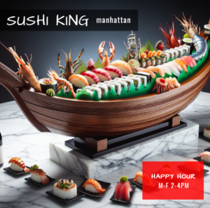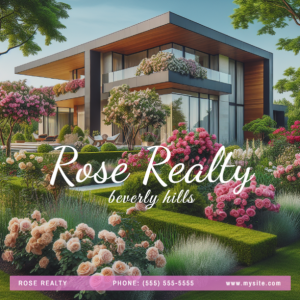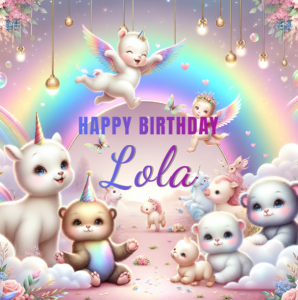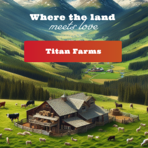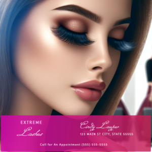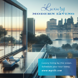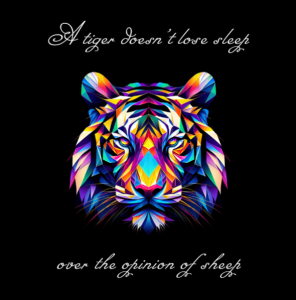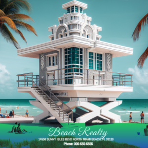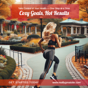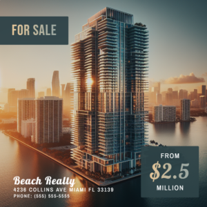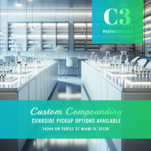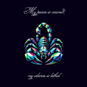

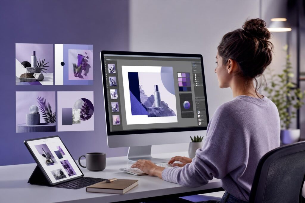
Your business needs a promotion graphic today, a customer testimonial tomorrow and an event announcement by Friday. The challenge is not a lack of content ideas. It is turning those ideas into visuals that look consistent, credible and ready to publish.
Without a dedicated design team, social media graphics often become a collection of rushed decisions. Fonts change between posts. Images come from unrelated sources. Important text is squeezed into the wrong format. Every new graphic starts from an empty canvas.
The practical alternative is not to imitate a full creative department. It is to build a lightweight visual system that reduces how many decisions you need to make each time. With a defined structure and an AI-assisted editor, a founder, marketer or small team can move from concept to finished asset without sacrificing basic brand discipline.
Why social graphics become harder than they should be
Most small-business design friction comes from the workflow surrounding the graphic, not the act of placing text on an image.
Before publishing, someone still has to decide:
- What the post should communicate
- Which image supports that message
- How much copy belongs on the graphic
- Which colors, fonts and visual effects fit the brand
- Whether the final result remains clear on a phone
When those decisions are made from scratch for every post, visual production becomes slow and inconsistent. Adding more software does not automatically solve the problem. You need a repeatable set of creative boundaries.
Start with a small social media design system
A useful visual system does not need a complicated brand manual. For everyday social content, begin with a one-page reference covering a few essential choices.
Choose a limited color palette
Define one primary brand color, one supporting color, a neutral background and a high-contrast text color. Fewer choices make it easier to maintain consistency and avoid combinations that compete with the message.
Assign roles to your type styles
Select one style for short headlines and another for supporting information. Then set a simple hierarchy: the main idea should be visible first, while dates, conditions or explanatory copy remain secondary.
A social graphic should not carry the entire caption. If every sentence feels essential, move the detail into the post copy or destination page.
Define two or three image directions
Decide what kinds of visuals belong to your brand. A home-services company might use clean property details, tools and completed spaces. A consultant might favor organized workspaces, simple diagrams and professional portraits. An ecommerce brand may prioritize product-focused scenes and close-up details.
This direction helps you evaluate generated images, stock assets and uploaded photos against the same standard. If your broader identity is still unresolved, the AI Logo Generator can help you explore a guided brand concept before you establish recurring social treatments.
A repeatable workflow for creating each graphic
Once the core rules are in place, use the same production sequence for every asset. The goal is to separate message decisions from visual decoration.
1. Write a one-sentence communication brief
State the audience, message and desired next step in one sentence. For example: “Tell local homeowners that spring maintenance appointments are available and encourage them to request a booking.”
This prevents a common failure: trying to promote several offers in one graphic. If the brief contains multiple audiences or actions, split it into separate posts.
2. Choose the right visual source
Use a real photo when the specific person, product, location or completed work matters. Use a stock image when you need a credible general scene. Consider an AI-generated image when you need a visual concept that is difficult to photograph or find.
For example, a business coach could generate a polished planning scene for an educational post, while a contractor should usually use real project photos when showing completed work. AI generation expands your options, but it should not replace evidence customers need to evaluate your business.
3. Build the visual around one focal point
Choose either the image or the headline as the dominant element. Avoid making the logo, offer, photo, decorative shapes and call to action compete at equal strength.
With the Elite UI AI Image Editor & Image Generator, you can work with AI-generated visuals, uploads or stock images, then add text, shapes and effects using layers. Keeping those elements in a single editing workflow reduces the friction of moving between separate generation, layout and finishing tools.
4. Adapt the composition for its destination
Do not assume that one layout will work everywhere. A graphic that feels balanced in a wide composition may become crowded in a taller or more compact placement.
Protect the focal point, shorten the headline if needed and check that essential elements are not sitting too close to the edges. Adapt the composition intentionally rather than shrinking everything until it fits.
5. Run a mobile-first quality check
Before exporting, view the design at approximately the size someone will see while scrolling. Ask:
- Can the main message be understood in a few seconds?
- Is the text readable without zooming?
- Does the image look intentional rather than decorative?
- Are spacing and alignment consistent?
- Is there one clear next step?
- Does the post feel recognizably connected to the business?
Also inspect generated visuals for awkward object details, implausible scenes or embedded lettering. Important business copy is usually better added as a separate text layer, where you control its wording and presentation.
How this workflow changes by business type
The system stays consistent, but the evidence and visual emphasis should reflect what customers need from the business.
Local services: Combine real job photos with simple offer, availability or educational graphics. Generated imagery can support general seasonal topics, but actual work is more persuasive when proof matters.
Professional services: Use restrained visual concepts for insights, checklists and event announcements. Prioritize readable headlines and a credible tone over heavy decoration.
Ecommerce: Keep the product visually dominant. Use supporting backgrounds, shapes and effects to establish context without making the item difficult to recognize.
Creators: Establish a recurring treatment for titles, portraits and series labels. Consistency helps separate an ongoing content format from one-off posts.
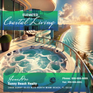
Real estate: Use authentic property imagery for listings and generated or stock visuals for broader educational topics such as preparation, financing questions or moving checklists.
Will AI-generated graphics look generic?
They can if the direction is generic. A request for “a professional business image” leaves nearly every visual decision unresolved. Better results come from specifying the subject, setting, composition, mood, color direction and intended placement.
Even then, the first output should be treated as source material rather than an automatic final asset. Review whether it fits your brand, edit the composition and add business-specific messaging separately.
Consistency also comes from repeating your art direction. If one post uses bright editorial photography, another uses dark futuristic illustration and the next uses playful cartoons, the feed will feel disconnected regardless of the quality of each image.
Does an AI image editor replace a designer?
No. A self-serve editor is most useful for recurring production: promotional posts, announcements, educational graphics, campaign variations and visual concepts that follow established rules.
A designer may still be the right choice when you need a complete identity, an original campaign concept, complex illustration or high-stakes creative direction. The efficient model is often to reserve specialist help for defining the system and use an accessible editor for ongoing execution.
This distinction matters because the goal is not to remove creative judgment. It is to reduce avoidable production friction.
Is an AI Image Editor a good fit for your business?
This workflow is likely a fit if you regularly need visual content, already understand your core offer and want to create assets without coordinating every small change through a full design process. It is especially useful when you need flexibility across generated images, uploaded business photos and stock assets.
It may be less suitable as your only solution if your brand has not yet chosen any visual direction, multiple stakeholders must approve every creative decision or your campaign requires specialized original artwork. In those cases, define the strategy first and use the editor once the boundaries are clear.
You should also consider who will own the process. One person should maintain the color choices, image direction and quality checklist, even if several team members contribute ideas. Clear ownership prevents the system from drifting over time.
Build the system before increasing output
Producing more graphics will not fix unclear messages or inconsistent visual choices. Start by documenting a small set of rules, create a few repeatable content categories and follow the same brief-to-export sequence for each asset.
Once that foundation exists, AI-assisted image creation becomes more practical. You are no longer asking a tool to invent your brand with every post. You are using it to generate and assemble visual material within boundaries your business has already chosen.
When you are ready to turn your next social post idea into a polished visual, open the editor and Create an AI Image.
Ready to Turn This Into a Faster Workflow?
Try AI Image Editor & Image Generator inside Elite UI and move from research into a real business-ready result.
Product features, pricing, plan details and availability may change. Check the current Elite UI product page for the latest information before purchasing or publishing.